
Account Menu
tastytrade’s previous account menu was an icon located in the lower-left corner of the left navigation. While it was discreet, clicking it opened a popover that displayed a limited amount of information related to the customer’s account(s). However, this popover often appeared on top of crucial trading-related information and was constrained in the amount of detail it could show.
Solution
The idea was to create a dedicated, easily accessible location for all account-related information. The account menu was moved to the platform header in the top-right corner, where it displays the account name, account number, and the associated symbol/icon.
By embedding the account menu in the top-right of the page header, we created a far more accessible experience with a dedicated panel to display all of the customer’s accounts and the key metrics for each.
Once open, clicking an account expands it to show relevant account data and actions such as risk monitoring and deposit functions. The account currently selected for trading is highlighted with its respective color scheme, and the trade icon to the right is shown as active.

Similar to the interaction as above, another account can be quickly viewed with activating it for trading.
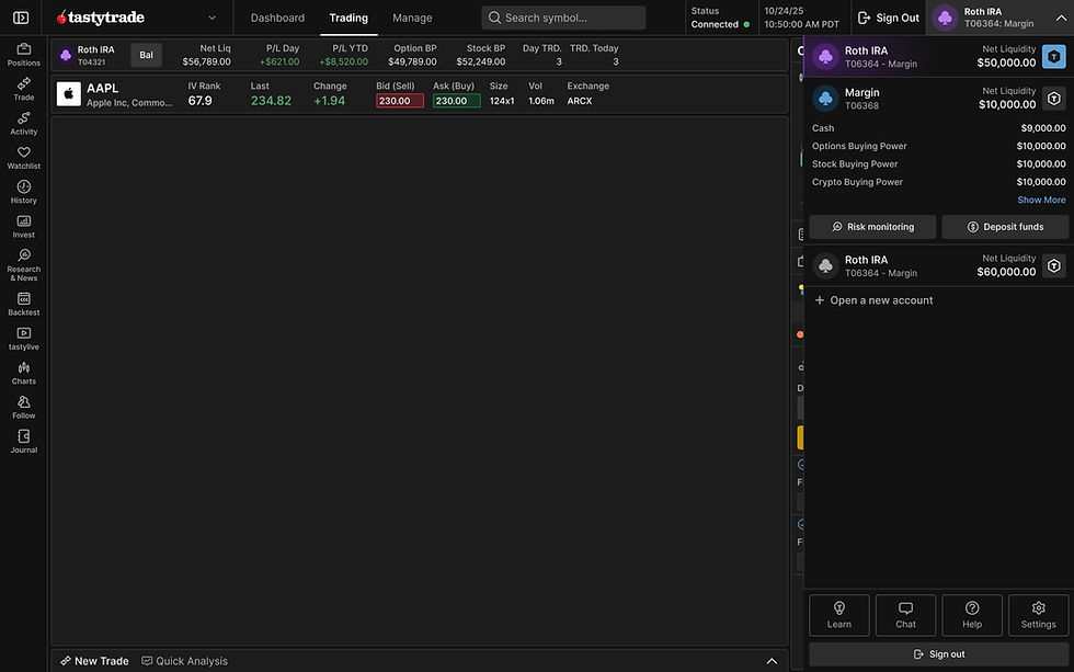
Simply clicking the trade icon on an inactive account selects it for trading. The active color scheme updates accordingly, and both the account menu dropdown and the balance header in the center of the page refresh to reflect the newly selected active account.

Some accounts may accrue warnings, such as pattern-day trading restrictions, funding issues, or accounts set to close. These warnings are displayed within the expanded account state, and an indicator is also shown in the account menu dropdown button whether it is open or closed.

On smaller screens, much of this information can become congested quite quickly. A solution for both quality of life and space-saving was to place secondary and tertiary information, mostly relevant to a help desk representative.

Account, notifications, and resources, all in one click.
The account slider also provided additional secondary links and information, such as opening a new account, live chat, settings, help desk, educational resources, and sign out.


Conclusion
Once fully implemented, we saw a sharp drop-off in calls related to account information and general inquiries about how to find specific information related to customers’ accounts.